Antipatterns
This chapter presents a list of approaches that have proved to be ineffective in regards to the user interface and hence should be avoided.
Executing Use Cases From User Interface
The first very common antipattern is mixing use cases and screens in a single specification. While the screen is an implementation artifact that will actually become part of the final solution, the aim of use cases is to describe high-level user goals that yet need to be decomposed to implementable artifacts. The level of abstraction of both is different, and for this reason, they are not compatible in the way that one cannot call the other. Besides, use cases should not include any implementation details, so a good use case does not even mention the existence of any user interface (apart from referencing screens to trace where the use case steps are realized). As a result, the use case scenario should never state something like this: "System opens dialog SCR-005". Similarly, the screen cannot be hard-wired with a use case: "Pressing the button starts use case Delete Customer". It is possible to specify the use case by stating which screens realize the particular use case steps, but it does not make sense to reference high-level use cases from the user interface. If the user interface triggers some complex user-system interaction, it should be described using activities.
Repeating General User Interface Rules in Each Screen
Duplication is wrong, it should be avoided, and it is especially true for user interface specifications. General rules which apply globally to all screens should be stored in one place only and referenced. For example: "The OK button is a submit button, so it must be green and have rounded corners". If there are obligatory user interface guidelines, what is the point of repeating it for each screen? Stating that the OK button is a submit button would be sufficient in this case.
Describing User Interface With Text
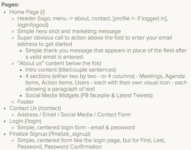
Everything could be described with text, but it is not the most convenient way in all cases. Screens, screen maps, or screen flows are typical representatives:

Eventually, the team will be able to implement the website anyway, but the efficiency will lag behind.
Including Other Artifacts Descriptions
Another bad habit which we see a lot in user interface specifications is describing business rules, business terms and other artifacts directly in the screen specification:
Button is enabled if the user is marked as a debtor. The debtor is a person whose debts filled in the central debtor registry are higher than $500.
If the amount changes from $500 to $450, you need to go and change it on all screens. Business rules and other artifacts must be kept in the central repository and just referenced; otherwise, the documentation is unmaintainable.
Including Business Logic
BUTTON Delete Debtor - Button is enabled if the user is marked a debtor. Debtors are downloaded once a day from a central debtor registry and the debtor flag is stored in CRM.
This antipattern is very similar to the previous one - it would cause duplicating the logic regarding downloading the debtor list in many places. But this one is even more serious, as nobody would expect this information to be included in the specification of the button which deletes debtors. As a result, if the logic changed, it would probably remain outdated here.
Indirect Definitions
- "BUTTON Create AB Insurance: Button is enabled only if the input text field 'Length' is editable."*
The condition for enabling the button is the same as for the editability of the input text field. So the analyst in goodwill to save time just referenced the condition, which states: "Text field 'Length' is editable if the selected vehicle is a truck". It looks like a good idea, but it presents some serious issues, though:
- If the editability of the 'Length' field changes, it will, as a side effect, automatically change the condition for enabling the button
- It is not clear when and why the button should be enabled from the business perspective. The reader should learn that the button is enabled only for trucks because the AB Insurance is a product offered only for trucks (preferably by linking to the particular business rule).
Batch Definitions
To save time and to make the analysis more concise, analysts sometimes apply UI rules to multiple elements at once:
The following input fields are editable: Name, Birth Date, Address. Others are not editable.
Such a definition is prone to future mistakes. What if we add a new field and will forget to correct the statement? The field will implicitly become non-editable, which is not the expected behavior and what is worse, it will be very hard to detect this mistake.
- Name is visible by default, always editable
- Birth Date is visible by default, always editable
- Age is visible by default, not editable.
- Address is visible by default, always editable
Unnecessarily Complicated Descriptions
Writing right to the point is a general practice that aims to keep any documentation concise, without puzzling readers and taking more of their time than is necessary. Although the rule is not specific to the user interface, we would like to explicitly emphasize the need to write simple, right-to-the-point user interface specifications.
The following statement is an extract from the real system specification:
In case this option is selected, the system quickly opens a new modal window, in which user can enter a new record in an intuitive user interface.
It may be a matter of taste, and some teams may prefer this florid style, but we generally recommend a brief, to-the-point style:
Onselect: Opens a screen to enter a new record (SCR 123)

