Good Practices
The following practices aim to help you make the user interface documentation more structured, easy to read, and maintain.
Including Business Description
Screens, as well as any other UI elements, are not abstractions; they are real artifacts that are or will be implemented in the system. For this reason, the way they are described depends on the purpose and the needs of the development team. But no matter how detailed the description is, it should always start with the business purpose. In all cases, it must be clear what is the business goal of the UI element before going into details. Learning that clicking on the button calls a particular service is of no value if it is not clear why the user should want to click on it in the first place. For example, a description of the "Save Customer" button should state that its purpose is to store the person in the system, and it includes these steps: it validates customer data entered by the user, saves the customer in the system and redirects the user to the customer detail. As you can see, the description is brief and is very similar to how the use case scenario/activity is written in terms of the level of detail - it is user-goal.
Separating Business From Implementation
A screen is one of the artifacts which are used for communicating requirements with both the stakeholders and the development team, so it includes a business description as well as implementation details. On the one hand, it should be clear what is its business purpose and how it is expected to behave from the perspective of the user, on the other hand, it should include enough detail for developers to be able to implement it.
- What is the purpose of the screen element or the screen itself
- What is the content of the screen
- Which elements are visible, enabled, read-only, etc.
- What data validations should be applied etc.
- What is the source of data displayed on the screen
- What are default values, how the tables are sorted etc.
- How the data fields are mapped to the data coming from the data source
- What functions or services are called when some event is triggered (a screen was loaded, a button was clicked, etc.)
Concerning the user interface, it is especially important to separate the business layer from the IT layer and structure the content of the user interface specification properly, because otherwise the specification quickly turns into a long unreadable mishmash of information. The analyst needs to clearly separate what is meant to be communicated to business stakeholders and where the implementation details start.
Let's demonstrate the separation on example:
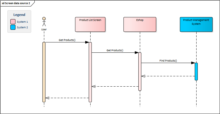
The sequence diagram above depicts the separation of information represented by the Product List Screen, which serves as a "landing zone" of the user requests. Such facade transforms user actions to system functions, without revealing the implementation details. Everything important to the business stakeholders takes place on the left side of the facade, whereas the internal functions and implementation details are on the right side. This way, the user goals are separated from the technical details, yet at the same time, it preserves the traceability between the levels:
- The
Get Productsfunction called by the user is an abstraction of the user goal - the business function. The user wants to display a list of products and does not care how the screen/system does it. The user sees just the screen and the business function, while everything else is invisible to him. - The
Get Productscalled by the screen is an internal function of the Eshop, whose purpose is to get and prepare data for the screen by callingFind Productsservice of the Product Management System. This part is not interesting to stakeholders but is important for the development team as it shows the implementation details.
Encapsulating Behaviour
The example presented in the previous section showed another good practice - the separation of concerns. If you look closer at the diagram, you will realize, the Product List Screen does not include any business logic. Instead, the screen delegates the work to other entities - it simply accepts the request from the user and calls a function. Without the separation, the diagram could look like this:
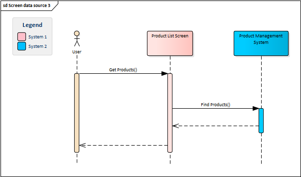
In this case, the screen directly calls the service. It is shorter, faster to model, and expresses clearly what the system does behind the scenes. So what is the problem? The issue is that the service is not called by the screen itself, but by its owning system. Also, very rarely does the screen display data exactly as it came. In most cases, the data must be processed somehow before it is displayed, but this should not be part of the screen specification, as it would inflate it and clutter it with unnecessary implementation details. The better approach is to encapsulate the behavior to a function that isolates the behavior, makes it easier to maintain, and enables sharing it between other components. This applies to any internal function, such as performing a calculation, calling an external service, or executing a database procedure.
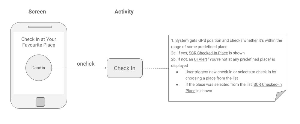
Besides the internal functions, the user action can also trigger a subsequent user-system interaction. Clicking on a button does not always perform a system function or calls an external service, but it may also trigger another interaction with the user - open up a dialog, ask the user for additional input, and so on. If the interaction is trivial, it could be included directly in the UI element's specification. However, the user action may also represent a non-trivial user-system interaction, which should rather be separated into an activity:
Technology-Neutral Specification
In the chapter dedicated to the use cases, we advised against including implementation details in the use case specifications as it requires rewriting use cases every time some detail changes. The same logic applies to the user interface specifications. The analyst should primarily focus on which screens are important, what data they should display, or what data validations should be applied. The screens should be outlined in as much technology-neutral form as possible to prevent spending much time changing them each time some underlying technical aspect changes. The same applies to design. In many cases, the final design of the system is not known until a very late project phase, so it is wasting time to include it into the business specifications.
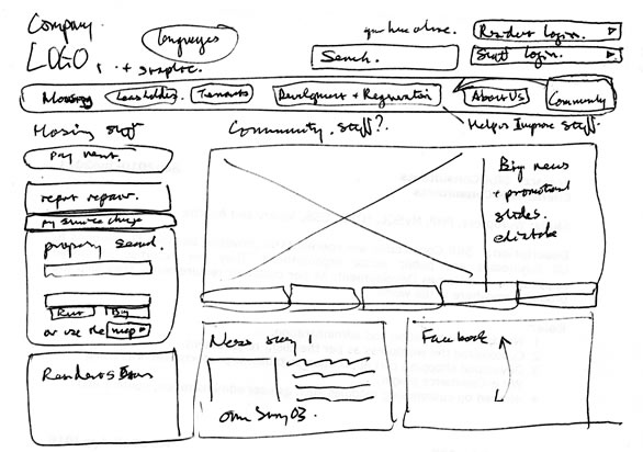
Therefore, analysts should spend very little time playing with wireframes during analytical activities. The good practice is to choose the approach which is easy to use, allows quick response to changes, is acceptable for the stakeholders, and provides enough details for developers. It may be anything from simple hand-drawn sketches to sophisticated wireframing tools with features such as screen transitions, data mocking, or animations. The selected approach depends on the environment and needs of the particular project, but the KISS principle should always be kept in mind.
Illustrative picture
Using Declarative Approach
The typical way to describe the behavior of the user interface is using the so-called imperative style. This style specifies steps which the system must perform to create the UI:
- System loads customers to the customer list
- If the list is not empty, system selects the first item in the list
- If the list is not empty, system enables the button "Customer Detail", otherwise it disables it
- If the list is not empty and the user has admin rights, systems enables the button "Delete Customer", otherwise it disables it
On the contrary, the declarative way describes what the user interface should be like, without stating how to achieve it:
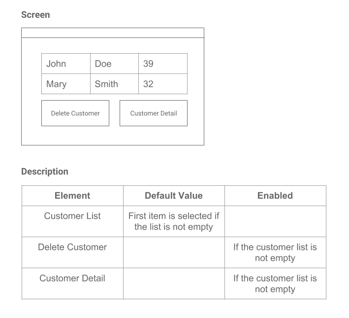
- The first item in the list is selected if the list is not empty
- The button "Customer Detail" is enabled if the list of customers is not empty, disabled otherwise
- The button "Delete Customer" is enabled if the list of customers is not empty and the user has admin rights, disabled otherwise
The declarative style does not state in what order the buttons are enabled. It is also not important whether the list item is selected before or after the buttons are enabled. The analyst just indicates what should happen and expects it to happen. This is a very convenient style which lets analyst focus on whats instead of hows, and which also makes the UI description more concise and easier to read. Another benefit is, the specification of the behavior is always attached directly to the element, so it is easy to find:
Referencing by Id
When describing screens, we need to somehow reference the elements. We can do it by using labels as we did in the previous example, yet, this is not a recommended approach on real projects. Labels are ambiguous, may change, and some elements do not have labels at all. Instead, we recommend using numeric identifiers:
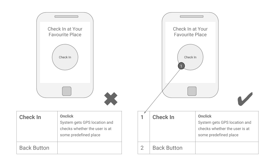
The reason why we recommend to supplement every significant UI element with a numeric identifier is that the numbers are unambiguous. Referencing a button by the "Create Customer" label presents a risk, that once somebody renames the button, the specification breaks. This approach may work for simple dialogs containing just a list of items and a button, but for complex screens, referencing by id is definitely the way to go.
Data Processing
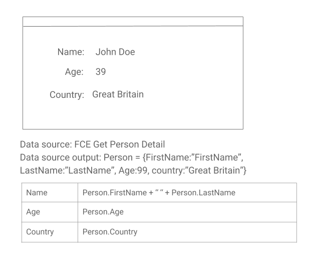
Most screens, except informative dialogs containing static text, display dynamic data to the user. To present the data on the screen, the analyst needs to specify the following: where to get the data, its format, and how the data will be mapped to user interface elements.
1. Getting Data
There are basically two options where the data could come from:
- Data coming from the system which owns the screen. Data is accessed through the system function.
- Data coming from an external system. Data is accessed through a service.
This means that if the screen is to display some data, there must always be a function responsible for getting it and preparing it for the screen:
Data Coming From the System Which Owns the Screen
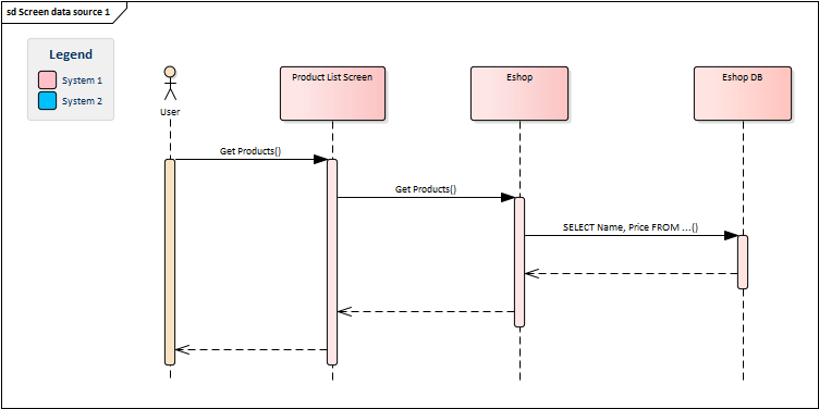
Data Coming From an External System

2. Mapping Data
Once the system has the data, it must know its format. The format is the structure of the output of the function or service. The system either takes the data as it is and displays it or it may "pre-process" it somehow for the screen:
Splitting Big Screens
Sometimes, particularly when specifying large enterprise systems, the screens may become too big to be handled as one piece. In this case, it is better to logically divide the screen into multiple parts and describe them in separate specifications to make it more readable.
Reusing Screen Fragments
User interface very often consists of compartments that are shared by multiple screens, for example, menus, headers, or logos. These parts, called fragments, should be described only once and reused to avoid duplication.
Unified Documentation
Screens have a big advantage: their specifications could be, to a great extent, standardized. Each screen includes a wireframe and a list of elements with their descriptions. The structure could be therefore unified as well as the list of UI elements attributes. It does not matter whether the screen is described using a table or something else, the important thing is it is consistent. We show an example of the structure in the part 3.
It is not just about the structure, though, the consistency of the specification is also important. It is frustrating when some analysts call the element text box, some input text, and others input field text. There should be a standardized set of fields used consistently across the project or product no matter what technology is used. All modern applications share the common set of components, such as button, checkbox, or a list of items, so the standardization could be easy.
The same applies to UI events and elements attributes. Events are actions that can be triggered by the element or the screen itself, such as button.onclick, screen.onload etc. There should be a standardized list of these events, and everybody on the project should learn what the specific event does and what events could be triggered by particular elements. Besides events, every element has a set of attributes that define the characteristics of the screen elements, such as enabled or visible. These attributes should be unified too.

