Development Vs. Post-Release Documentation
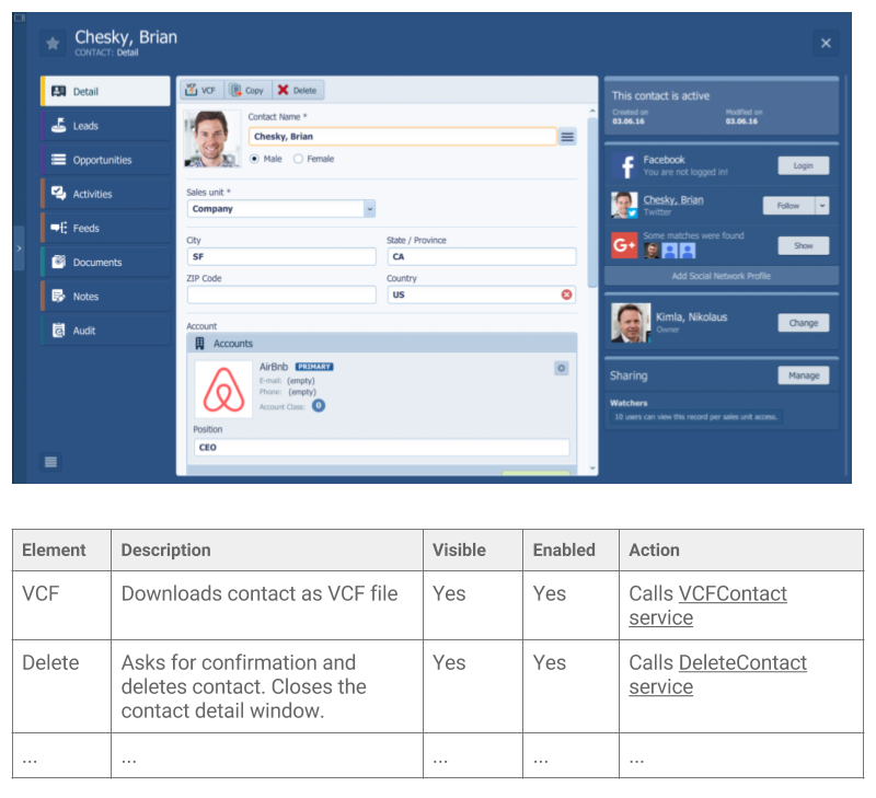
A screen is an artifact that plays an important role during requirements elicitation, but at the same time, screens are also an essential part of the released system's documentation. Abstract artifacts such as use cases play a major role during the early analysis phases, and they are rarely transferred to the post-release documentation. The user interface specification, on the other hand, is used to discover, verify, and implement the requirements but also to document the current workings of the production systems.
As a result, the user interface description could have two different forms:
- Development specification - the goal is to capture the requirements for the solution, verify them with stakeholders, and describe them in detail, which enables the development of the solution. This means that the form of the specification cannot be prescribed, because each project has different needs, different stakeholders, and different development team.
- Post-release documentation - the goal is to document how the solution works in production - the as-is snapshot. It must include both the business description and the implementation details.
Development Specification
Until the solution is developed, screens represent a specific group of requirements, meaning that the same principles and good practices apply to the user interface as to any other requirements. Also, similarly to other requirements, it cannot be said what form and what level of detail the user interface specification should have. Some teams will need or want to specify most screens in great detail upfront, as it may be dictated by the selected software development process. Other teams may produce only a couple of hand-drawn sketches and add all details just in time when it is really needed for development.
But no matter the situation, project or software development process, being agile is definitely the preferred way when specifying user interface. Using light-weight techniques such as sketches, modeling with users, showing prototypes, or even doing live demonstrations help stakeholders think about the solution more vividly, which enables them to come with better, more accurate requirements.
Depending on the level of detail the screen is expected to include, there are 3 different stages of documenting user interface requirements:
Stage 1
The first stage involves creating simple sketches aiming to illustrate only the most general purpose of the screen, along with the basic layout, which will help analysts and stakeholders to agree on the screen behavior. At this stage, screens are independent of the technology and could be drawn using some simple tool or could even be hand-drawn. Such screens usually lack typographic style, color, or graphics, since the main focus lies in its behavior. In other words, it focuses on what the screen does, not how it looks. The common name for this technique is a wireframe.
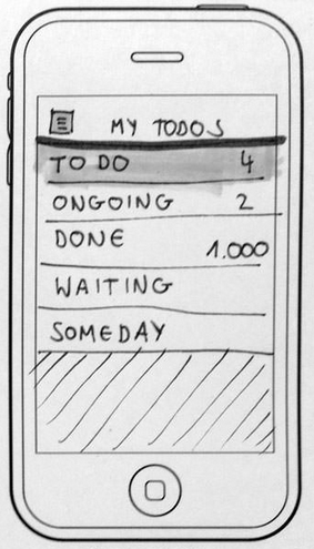
This stage is especially beneficial in the early phases of the analysis when it aims to provide basic visualizations that are easy to create and fast to change. In the early phases, it does not make sense to create pixel-perfect designs. It takes a lot of time, and since requirements change rapidly at that time, the effort would most likely be wasted. Instead, analysts need to be flexible to keep pace with the changing ideas and should use just light-weight, easy-to-change approaches.
TIP
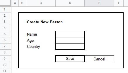
For business applications which consist mostly of screens containing just simple form data, we have been successfully using spreadsheets. They allow analysts to layout the elements in the implicit "grid layout", and creating such wireframes is very fast and easy.
Stage 2
Stage 2 is basically just more formal wireframes. At this stage, the analyst produces wireframes as well (technology independent, focused on behavior, not design), but this time they are not hand-drawn but instead created using a tool. The tool enables analysts to work with the screens as with objects, which allows them to supplement the wireframes with metadata. Having just hand-drawn sketches is ultra-fast, yet it is not suitable for all environments. In many cases (rather big projects or not truly agile projects), it may be needed to describe also relationships between screens, requirements, business rules, or any other artifacts in general. If the screen is just a hand-drawn sketch, it is not possible to supplement it with metadata. When using the right tool, screens become objects which can have additional features such as relationships to services, systems, or other screens.

Stage 3
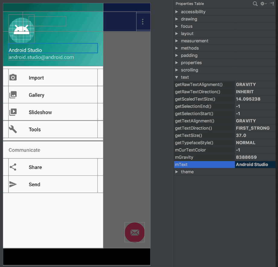
Stage 3 is represented by almost pixel-perfect designs that use platform-specific user interface elements. Such screens look almost the same as the screens of the final system. The advantage of stage 3 models is that there is no room for speculations from the developers' side as they get the final design and cannot apply their creativity. On the other hand, the overhead connected with each change is high, and since not many analysts are also designers, each change implies engaging a designer. It is very useful in cases when the user interface technology comes with a WYSIWYG designer, enabling each analyst to create almost final screens.
Post-Release Documentation
Releasing project to production means that the sketches and wireframes are no longer needed. Why document the application with a model, when the real screenshot could be used? On the other hand, creating such documentation for large systems consisting of dozens of screens may be time-consuming, and if the wireframes served well during development, they would also be sufficient for the documentation. It is then up to the team if they invest their time and tune the user interface documentation with screenshots of the real application or not.
The same applies to the analysis of changes to the existing systems. After the system is deployed, a lot of teams try to keep the models of the screens and use them for modeling changes. But at this time, they already have a production version of the system. They know precisely how the screens look, so the analyst could capture the screenshot, highlight the change, and update the documentation. Easy. Synchronizing wireframe models with the production version is a waste of time.
Additionally, the documentation does not need to be perfect. The Earth will not stop spinning if the button on the screenshot will be red instead of green or if there is a table instead of a list. The screen description will provide value when its business purpose is clear, and the core parts, such as where the data comes from, are up to date. There will be plenty of changes to the deployed system, and reflecting every tiny detail in the post-release documentation is an equally bad idea as it was during analysis.
Post-Release Screen Documentation Example
