Coherence
Understanding and documenting even an average-sized solution requires looking at it from multiple views and describing it using different artifacts and models. But to get the whole picture, the different perspectives must be put together, which requires them to be interconnected, and it must be easy to navigate between them. Each system is, in fact, just a network of cooperating, interconnected artifacts, and it is crucial to structure them the way which enables it to quickly find all related elements. This applies to both artifacts and models that visualize relationships between them.
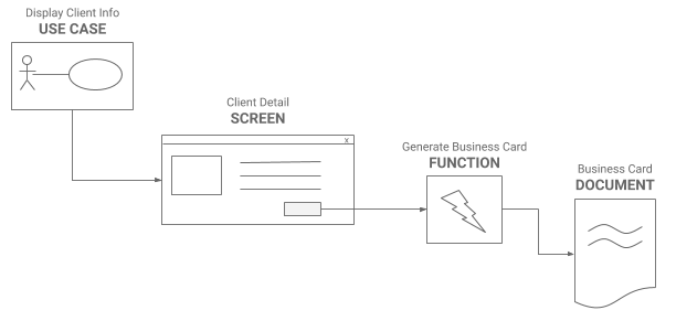
The following example shows a decomposition of a feature to the individual artifacts which developers need to implement:

- It shows that the use case is realized by the Client Detail screen
- Besides displaying the client information, stakeholders also need to be able to generate client's business card
- The business card will be generated using the Generate Business Card function when the user clicks the button on the screen
- The layout of the business card is defined in the Business Card Document Template
To understand how the system works, all four components are needed, so they should be kept together. This is called coherence. The easiest way to achieve that is to put them in the same place. It is a good start, but this does not help much with navigating - finding the artifact will still be manual work. The better approach is to ensure coherence by connecting the related artifacts using links. This way, it is easy to reference the related artifacts and navigate to them automatically.
TRAP: Link, not Include
Keeping related information together increases the readability of the outputs and the overall analysis efficiency, but only if it is done right. Going back to the previous example, it is easy to navigate from the "Generate Business Card" function to the "Business Card Template" to learn how the business card should look like, but the function itself does not contain the business card template description. Instead, it just references the template artifact. This way, the coherence is assured, yet the artifacts are loosely coupled, meaning that one does not include another so that they could be reused.
Why is it so important to keep things separated yet coherent? Let's demonstrate it on example:
Clicking on the heart icon marks the article favorite. Favorite articles are displayed in the "Favourites" section. Opening favorite article removes it from the "Favourites" section.
This description looks ok at first sight. It says what happens when the icon is clicked, and it also provides a context describing the logic behind the favorites articles. However, it is a time bomb.
Although it is certainly beneficial to have a description of how favorite articles work, it is a bad idea to include it in the description of the behavior of the button. First, it is counter-intuitive, and nobody would expect it there, and second, would you include it to every button which manipulates favorites articles? Hardly, as it would duplicate the information, which is bad. The better approach is to create an overview and link this overview from where it is needed. This way, the coherence will be assured but without duplicating the information and without tightly coupling it.
Linking Element
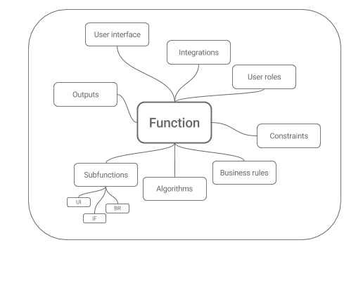
When applying the coherence principle, it quickly becomes clear that there is usually one central artifact through which other artifacts are grouped together. It depends on what is analyzed, but typical examples of these "glue artifacts" are process steps, use cases, UI screens, or system functions. In this chapter we are going to show how use cases play a role of such "hub" during requirements analysis, whereas the example below demonstrates the same thing in the design phase, where the linking element is the system function:


